True Blue Turns 30
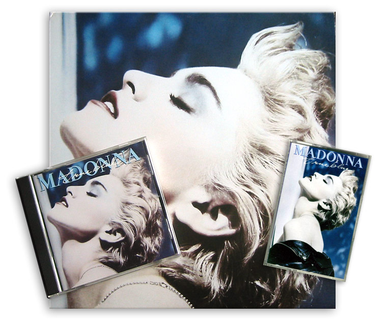
On June 30, 1986, Madonna released her third studio album with Sire Records. True Blue was co-written and co-produced by Madonna with Stephen Bray and Patrick Leonard, and was inspired and dedicated to her then husband Sean Penn. The album entered iconic status not only due to the classic songs it contains but also for the incredible and powerful packaging, which is still very contemporary, based on one of the most iconic images of the Queen of Pop shot by Herb Ritts.
Ten years ago, when True Blue turned 20, the MadonnaTribe Team has had the pleasure to have a brief chat with Jeri Heiden, the woman in charge of the cover design of True Blue as well as many other Madonna albums like Like A Virgin, Like A Prayer, and You Can Dance.
Celebrating True Blue ‘s 30th anniversary, let’s have a look back at our chat with Jeri focused on the making of the album’s iconic cover.
What do you remember about the first meetings you had with Madonna? Did she already have a clear idea of what she wanted?
Jeri Heiden: I was working in the art department at Warner Bros. at the time – on staff as an Art Director. At that time, most artists worked with us in-house.
Madonna had commissioned the Herb Ritts photo shoot – she was already highly aware of the value of her image and was in control of it. The photo shoot was given to me to edit – it was at least 60 rolls, mostly 35 mm.
Good thing my eyesight was strong back then!
I edited the session and made recommendations for prints. We ordered about 30 or 40 test prints from Herb’s studio. Other than that, there was no specific idea for the cover.
The back cover of the album presents the song titles written in what was thought to be Madonna’s handwriting.
JH: Sorry if I am busting a myth – but that’s my handwriting!
I have used my own handwriting on numerous albums, and have had several different fonts created from it.
So… I guess it was my idea.
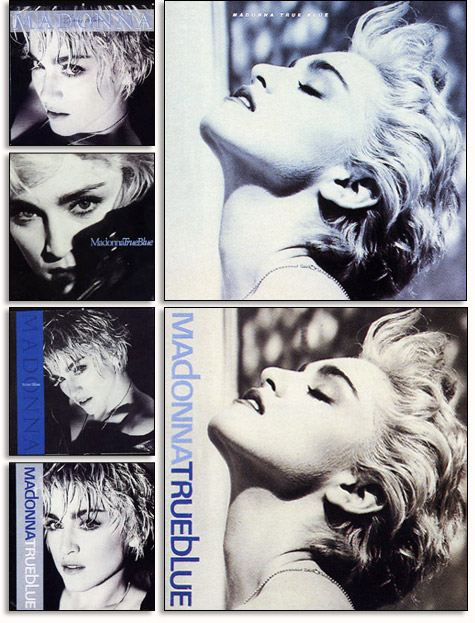
Talk about busting a myth, indeed! Speaking of the front image, there are two different versions of the True Blue cover, there are copies printed in Canada and the U.S. that just have Madonna’s face with no logos.
Other copies released in the UK and Europe had the Madonna logo and album title on top. Is there a reason for this?
JH: We used a sticker in the U.S. – thinking it would be really cool if when you took off the shrink-wrap there was nothing left but the gorgeous photo of Madonna. It was so iconic.
Other territories were less confident I suppose, and felt that her name HAD to be on the cover. This isn’t unusual at all – for territories to modify artwork for their needs. I remember providing International with the alternate cover.
The cassette version of True Blue presented the full Herb Ritts image while the vinyl album cover had the face close up. Was it hard to crop that powerful image to fit the square size of the vinyl cover?
JH: No, not really. I think the image became more interesting cropped into a square – and at that time we always started with the album cover configuration.
It was like she was floating – her clothing was not visible. She took on the appearance of a marble statue – Goddess like.
In the vertical cropping you see her leather jacket and the wall, and it becomes more typical, editorial, earthly.
From what we hear, the original Herb Ritts photo was in black and white that was then hand tinted with blue tones. Can you tell us more about the process the led to the final result?
JH: That’s correct. The image was a 35mm b&w shot. I experimented with a variety of treatments, looking for a good compliment to the album title.
Several images by Herb Ritts were considered for the True Blue album cover, among them the ones that later became the Papa Don’t Preach and True Blue single photos and another amazing image that remains unreleased. Who was responsible in the end for choosing the final cover image?
JH: The final cover image was chosen by Madonna, myself and Jeff Ayeroff – Creative Director at WB at the time. It was so strong, it just became the natural choice.
Did Madonna had to approve the singles covers too?
JH: She approved everything, along with her management. And in the course of designing the album package there are often 2nd or 3rd ‘choices’ that we hold out for single sleeve artwork.

Your original artworks and logos were slighly modified in some foreign markets.
French singles had to have for some reasons all horizontal writings. Japanese singles had often totally different cover photos and UK picture discs often presented alterated layouts.
Did you work on those “extentions” of the True Blue project as well?
JH: No, typically these modifications were done in each territory. Although I really enjoy seeing them – especially the Japanese versions!
Among the many albums you did for Madonna, which is by far your favourite creation and the one you had more fun working on?
JH: True Blue remains my favorite Madonna cover and project.
Check out our full-lenght, 2006 original interview with Jeri Heiden here.


